Nurses' Salaries - Best and Worst in US
Community Challenge: Project Health Viz 2021 May
My redesign (Tableau File Here):

Reading time: 5 min 12 secs
Key Findings: Registered Nurse Median Salaries by State (2020)
The national median registered nurse salary is $74,313, based on data from the Registered Nursing Labor Stats dataset (1998–2020).
Above average (11 states): States paying 10%+ above the national median — typically those with higher costs of living or strong union representation.
Below average (13 states): States paying 10%+ below the median — often correlated with lower regional price parity.
Near the average (26 states): Salaries within ±10% of $74,313.
Notably, the variation in nursing pay tracks closely with regional cost-of-living differences. A state with a below-average salary may still offer strong purchasing power for nurses living there. See the hex tile map above for a full state-by-state view, and explore the Regional Price Parity viz for context.
Data source: Registered Nursing Labor Stats (1998–2020) via data.world.
Discussion
Like the cost of living, nursing median salaries are different in different states. The national median salary average is $74,313, according to the Registered Nursing Labor Stats (1998-2020). Eleven states have a higher than average nursing salary, while thirteen states are below the average wage for Nurses. Twenty-six state the salaries are within +/- 10 % of the national average.
Goals
Create a three-color US Hex Map to illustrate state with above, below, and average medium salaries
Enhance storytelling within a viz
Complete the challenge in less than 1 hour to prep for tableau certification
Complete a Project Health Viz Challenge
“Constant attention by a good nurse may be just as important as a major operation by a surgeon.”
Project Discussion
Challenges
US State salaries for Nurses data would allow me to use United State Hex Tile Maps for the US, which I had not done before but was on my list to create. Hex tile maps are great at displaying data for US States because it allows all the states to be shown similarly in size. This viz type makes it easy to show Hawaii and Alaska while removing the space Canada would take up in the worksheet. This chart type can use different colors to show data differences or even add line charts. I selected to show a color change since I wanted to focus on state differences in median salary by state.
Design Discussion
Hex Tile Map
A Hex Tile Map is a variation of the tilemap, except instead of using squares, it uses a hexagram-shaped tile. I used Kevin Taylor's blog post How to use hex-tile maps to eliminate the Alaska effect as guidance for how to create this chart. In the Reference Link at the end of this blog are links to other Hex Tile Map references, in case you would like to add a graph as the tile instead of color-coding.
Basic Steps
(Summarized From Kevin's Blog Post as a note to my future self. For detailed directions, see Kevin's work)
Join your dataset on either state or state abbreviation to the Hex Tile Map Plot file (download file), which was initially found in Kevin's post.
Add the mapping coordinates by placing Column on Column and Row on Row. It is also helpful to add Abbreviation to Label so you can identify the points.
Upside Down Map, the states are in the right location, but the positions of the state are upside down. This issue is due to the HexmapPlotFile, the quick fix is to edit the row axis and click scale reverse.
Changing the shape to a hexagon shape is done using the InvertedHex.png (download file) (file originally downloaded from Kevin's blog who originally downloaded from Matt Chambers). To change the shape, go to the mark card and click on the shape option. Then next, click on more shapes and select the file where it is located on your computer. I also added into my shapefiles in my repository, so I will always have it on hand. Adjust the size of the hexagons to your liking with the size option.
Now you are ready to add the color shading based on your calculation needs.
To have the labels right on the hexagon, change the alignment to center for height and width from the label card. Check box to allow labels to overlap. Kevin indicates they won't and considers this a required step.
Code Notes
Calculations
I used three calculations in this viz. For the first one, I dragged the median yearly salary onto a row and selected the Average to get the average value. I then used that number in a calculation to determine the % difference each state was from the Average.
Percentage Difference From Average
// Calc the difference for each state from the Average
// 73,413 is the average Median Salary
(([Annual Salary Median]-73413)/73413)
The last calculation was to define what was above or below the Average. I took the median data to a row and selected a violin chart. I use the cutoffs from that chart to guide what was out of range from the average. Instead of doing the cutoff this way, I could have used standard deviation from the mean. From my approach, +/- 10 % from the average was used to determine which salaries are above or below the national average. This calculation was used to color code the hex tiles for each state.
Color Percentage
// Define data as above, below, or average
// used +/- 10 % as the cut offs
If [Percentage] <= - .10 then "Below"
ELSEIF [Percentage] >= .10 then "Above"
Else "Average"
END
Colors Used
In creating the color palette for this viz, I wanted to use a variation of red to indicate the states with below-average salaries. I did not want to use a bright red that one would use as a warning since the variation in pay could be due to the lower cost of living in that state. In reviewing various reds, Indian red (#E15759) worked for the feel I was going after. I wanted a light gray shading for the state within the Average and found that Light Gray (#D5D5D5) worked perfectly. I wanted a color with a slight hint of green for the above-average color to indicate more money. Green Sheen (#76B7B2) met my requirements.
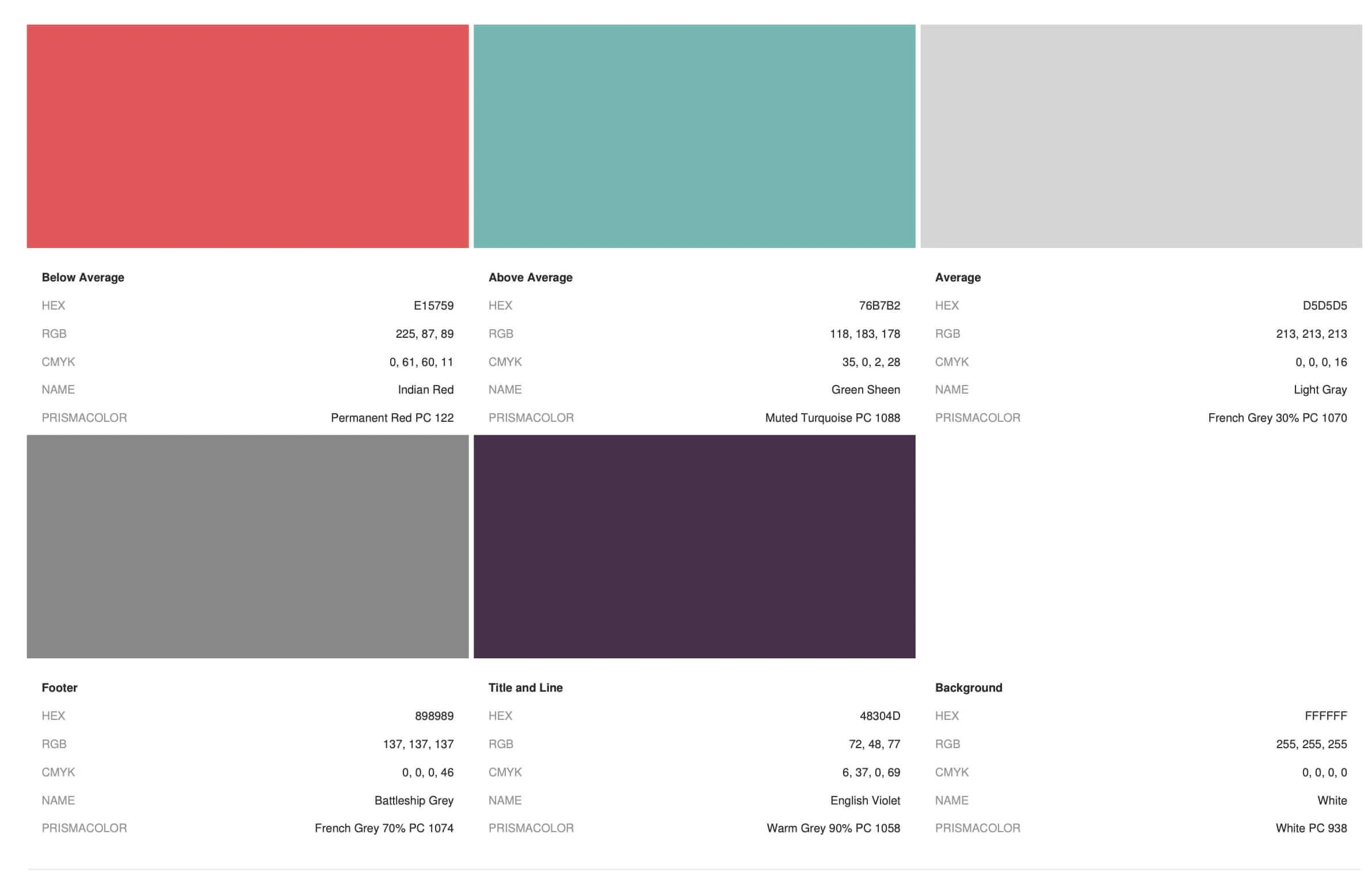
| Background | #FFFFFF | White |
| Title | #48304D | English Violet |
| Line | #48304D | English Violet |
| Footer | #000000 | Battleship Gray |
| Average | #D5D5D5 | Light Gray |
| Below Average | #E15759 | Indian Red |
| Above Average | #76B7B2 | Green Sheen |
Final Thoughts
Viz:
I enjoyed the #ProjectHealthViz Challenges. I will continue to do them in the future.
I am also now set up with notes to self, files, and an example viz to do color code hex tilemaps graphs in the future. I may also explore adding in line and area chart to this style of viz.
Data:
The analysis of the data does indicate that different states do have a variation in nurses' salaries. When comparing the Regional Price Parity For Each State, a Makeover Monday Viz Challenge from a few weeks ago, you can see that for some states, the difference from the national average could be due to the cost of living for those states. For several states, more information is needed to explain the salary differences.
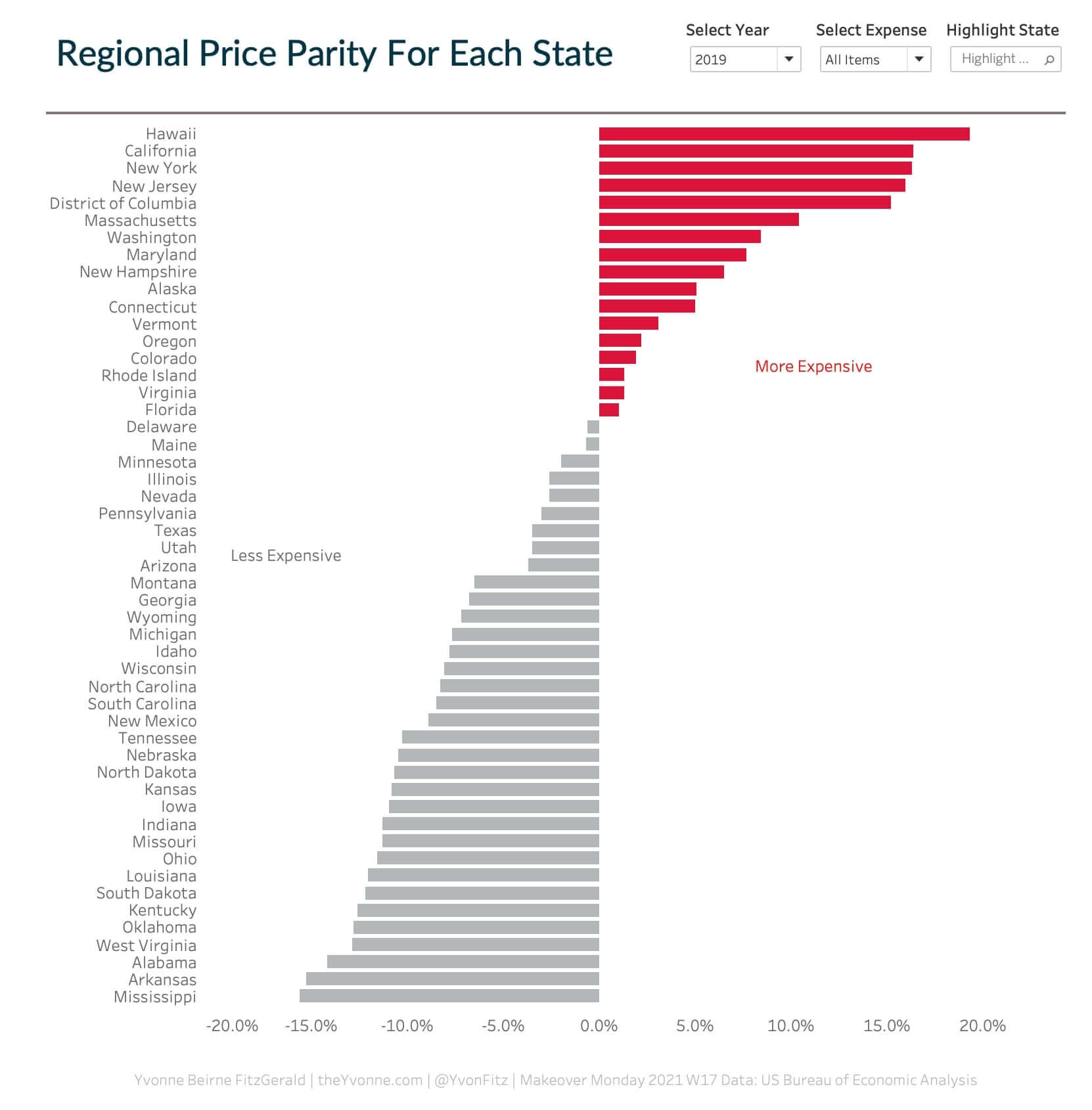
Regional Price Parity For Each State
What do you think? Let me know - Contact Me
Links & Additional Information
Challenge Information:
Data Source: Registered Nursing Labor Stats (1998-2020)
Challenge Link: Project Health Viz 2021 May
Looking for datasets or tools to use in your own challenge submissions or additional community challenges? Visit the Resources page for a curated list of data viz tools, free datasets, and community challenges.
For data sources and information covering gender equity, digital access, and global development indicators, visit the Public Health & Policy and Sustainability sections of the Resources page.
Reference Links:
Waffle Charts
Related Post You Might Enjoy