Crimson Brick Palette
Part of the theYvonne Palette Library. See all palettes: Genderly Inclusive | Genderly | IronOcean | Twilight Coast | Red Dock | Crimson Brick

Palette Details
| Background | #FFFFFF | White |
| Title | #2D1115 | Dark Sienna |
| Title | #DC143C | Crimson |
| Line | #000000 | Black |
| Footer | #ACB0B1 | Battleship Gray |
| Viz Highlight: Decreasing Populations | #DC143C | Crimson |
| Viz: Stable Populations | #CDCECD | Light Gray |
| Viz: Increasing Populations | #ACB0B1 | Silver Chalice |
Reading time: 1 min 22 secs
Usage
Highlight data that is in crisis or warning condition
Description
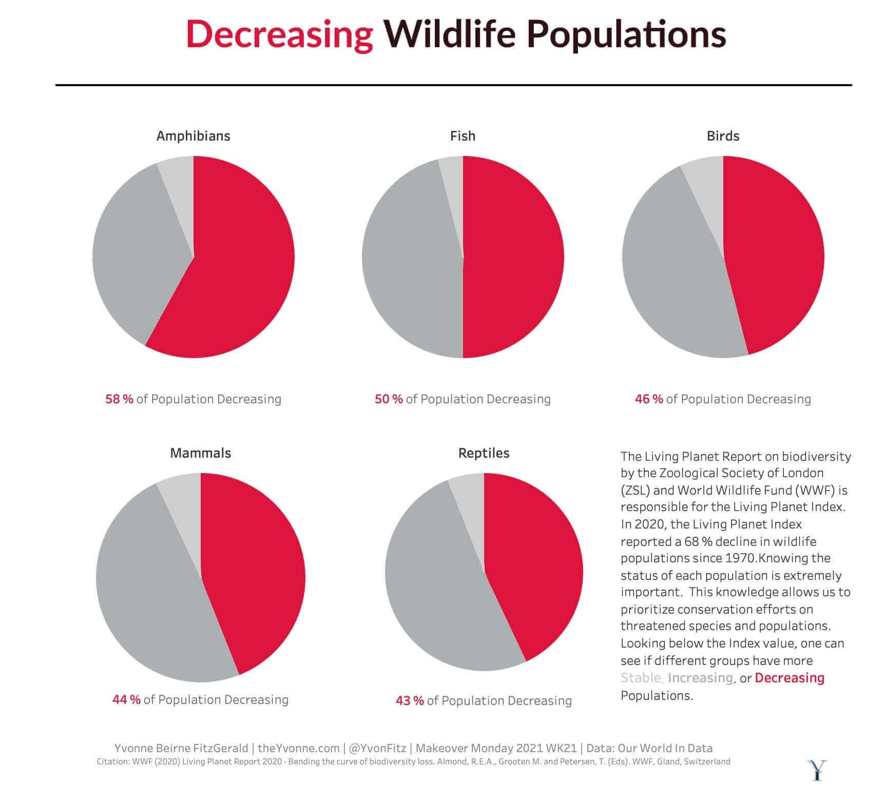
This palette was created for a data set with data split into three groups: Increasing, Stable, and Decreasing Populations. The goal of the viz was to highlight the decreasing populations indicating a warning. A Crimson (#DC143C) was selected to highlight the warning or crisis state data. Two gray colors were used to represent the data for the Stable Populations -Light Gray (#CDCECD) and Increasing Populations - Silver Chalice (#ACB0B1). This allows the data in the warning state to pop out and have full focus of the viewer. The color of the titles, line, background and footer was selected to focus on the warning state's data.
The story behind Crimson Brick:
Crimson Brick was created for the Makeover Monday 2021 Week 21 challenge on decreasing wildlife populations. The data had three categories: increasing, stable, and decreasing populations. The entire design intent was to make decreasing populations impossible to ignore, since that was the critical story the data was telling.
Crimson (#DC143C) was chosen for the warning state. It is a vivid, saturated red that immediately reads as danger or urgency without any explanation needed. The two gray tones, Light Gray (#CDCECD) for stable populations and Silver Chalice (#ACB0B1) for increasing populations, were chosen specifically because they recede visually. The viewer's eye goes to the red first, which is the point.
The title, background, and footer colors were also chosen to reinforce the warning state rather than compete with it. Dark Sienna (#2D1115) is a very dark, warm near-black that echoes the red without diluting it.
What each color does:
Crimson (#DC143C): decreasing/warning/crisis state, the primary focus of the viz Light Gray (#CDCECD): stable state, visually neutral Silver Chalice (#ACB0B1): increasing state, slightly darker neutral Dark Sienna (#2D1115): titles and structural elements, reinforces the warning tone Black (#000000): borders and lines
Hex codes (copyable):
#DC143C Crimson #CDCECD Light Gray #ACB0B1 Silver Chalice #2D1115 Dark Sienna #000000 Black #FFFFFF White
When to use Crimson Brick:
Any visualization where the story is about a crisis, decline, warning condition, or urgent problem. Works for environmental data, health data, financial risk, and any dataset where one category needs to shout and the others need to step back. The palette is intentionally uncomfortable in the best way: it makes the viewer feel the weight of the warning data.
Tableau Palette Code
Add the code snippet to your Preferences.tps, a xml file found in My Tableau Repository folder in your Documents directory. I typically Place above the </preferences> tag at the end. You can use a text or xml editor.

Tableau Code Snippet
<color-palette name="theYvonne Crimson Brick" type="regular" >
<color>#DC143C</color>
<color>#2D1115</color>
<color>#FFFFFF</color>
<color>#000000</color>
<color>#ACB0B1</color>
<color>#CDCECD</color>
<color>#ACB0B1</color>
</color-palette>
Preferences.tps Example File

Reference
Color Palette Information
To see all palettes I have designed for specific data analysis situations, review the Color Palette Portfolio Page. For more color palette tools and resources for data visualization, visit the Color Palette section of the Resources page — including tools specifically designed for accessible and inclusive design.
Example Viz
Red Brick Palette Example Viz

Red Brick Palette Example Viz
What do you think? Let me know - Contact Me
Related Post You Might Enjoy


