Decreasing Wildlife Populations
Community Challenge Makeover Monday 2021 Week 21:
My redesign (Tableau File Here):
Final Viz Selection For This Week’s Challenge
Reading time: 4 min 18 secs
Key Finding:
68% Decline in Wildlife Populations Since 1970
The Living Planet Index, published by the Zoological Society of London (ZSL) and World Wildlife Fund (WWF), tracks Earth's biodiversity using data from over 20,000 individual animal population studies.
2020 headline figure: a 68% average decline in vertebrate wildlife populations since 1970.
Breaking this down by animal group reveals that not all species are declining equally:
Fish populations show the highest share of decreasing trends.
Birds and mammals have mixed results — some groups are stabilizing or increasing, particularly where conservation efforts are concentrated.
Reptiles and amphibians remain among the most vulnerable, with habitat loss and climate change as primary drivers.
The single index value is useful for headlines, but looking at stable vs. increasing vs. decreasing populations by group is what allows conservationists to prioritize where intervention is most urgent.
Discussion
The Living Planet Report by the Zoological Society of London (ZSL) and World Wildlife Fund (WWF) is responsible for the Living Planet Index. This project gathers data on the Earth's biodiversity. In 2020, the Living Planet Index reported a 68 % decline in wildlife populations since 1970. This one number is a reflection of 20,000 individual stories on how each animal species is surviving. Having one value is a great way to get an overall understanding; knowing the status of each population is extremely important. This knowledge allows us to prioritize conservation efforts on threatened specials and groups. Looking below the Index value, one can see if different groups have more Stable, Increasing, or Decreasing Populations.
Goals
Highlight the decreasing population levels as an indicator of loss of biodiversity
Create a three-color waffle chart and present it as a small-multiple showing all the animal groups in one viz
Complete the challenge in less than 40 minutes to prep for tableau certification
Have the viz tell the story while keeping the design minimal
“We’re losing biodiversity globally at an alarming rate, and we need a cornucopia of different plants and animals for the planet’s health and our own. ”
Project Discussion
Challenges
Each animal group had three data points - stable, increasing, and decreasing populations. My goal for the viz was to represent these three pieces of information in one chart for each animal. I thought a waffle chart would best illustrate each population. Up until this point, I never did a waffle chart with three colors. I thought determining how to do the chart with each biodiversity status in the order I wanted would be difficult. It was not. The challenge was after I created the viz, I hated how it looked and had to go back to the drawing board. I did spend more time with this challenge than I usually give myself, but I thought the waffle charts looked busy and distracting. Instead of tweaking and tweaking in hopes of making something work, I started fresh. I permitted myself to take longer with this viz to enable the marriage of the critical story point and the viz. I did not give myself days or hours; the time was still limited.
Design Discussion
For this viz, I wanted to highlight the decreasing biodiversity. I achieved this by using #DC143C Crimson as the color for decreasing populations then selected shades of gray for increasing (#ACB0B1 Silver Chalice) and stable (#CDCECD Light Gray) populations. This choice allowed the decreasing populations to pop out of the viz and enable the viewer to see two groups.
I created a waffle chart using 100 squares for each animal group. The final viz had 500 squares. To me, the viz looked too cluttered and busy. I could have decreased the number of squares or blended them. The blending might work if I only had two groups, but I had three. When looking at the data this way, the viz looked off or that I made a mistake. I did not make the 10 square option since I thought showing the difference between 58 and 50 might not be easily seen, and I felt that was important. I cleaned the slated and started over. I found that I liked the visual impact of the pie chart when showing the five animal groups. In general, pie charts are not the best at conveying detailed information, especially with more than two data points, but I loved the visual impact. For me, I think it made the story pop out easier for the viewer.
Code Notes
Setting Up A Waffle Chart
My Original Viz Idea. I Thought It Was Too Busy.
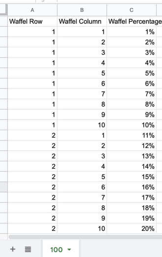
The initial setup for the viz was as waffle charts. This chart type requires a supporting file (download *.csv, download *.xls) to define the locations of the squares - set up for columns and rows, as well as the percentage completion. With this file, you can determine if you want the squares to fill top to bottom and/or to the left to the right by how you list the percentages.
Supporting File Need To Create Waffle Charts In Tableau
Add the Waffle file as data unjoined to your Tableau File. Create a worksheet and place Waffle Column in Column and Waffle Row in Row. Then select square from the dropdown list on the Marks card. Adjusting the size or shape if you would like.
Tableau Setup For A Waffle Chart
Colors Used
Since I wanted to highlight the decreasing populations, I knew I would use two different grays for the increasing and stable populations. Typically I like to use blue as my accent or highlighting color. For me, blue did not work with the feeling of danger or warning about the fact biodiversity is decreasing; for that reason, I selected a bright red color - #DC143C Crimson. I like white backgrounds since I feel it gives a clean look and does not compete with the data.
Color Palette For This Viz
| Background | #FFFFFF | White |
| Title | #2D1115 | Dark Sienna |
| Title | #DC143C | Crimson |
| Line | #000000 | Black |
| Footer | #ACB0B1 | Battleship Gray |
| Viz Highlight: Decreasing Populations | #DC143C | Crimson |
| Viz: Stable Populations | #CDCECD | Light Gray |
| Viz: Increasing Populations | #ACB0B1 | Silver Chalice |
Defining Colors
The calculation is a modification of the code from Ben Neville see link in the reference section below. Sheet1 is the data file containing information about the animal groups. Though created for the waffle chart, I used it for the colors in the pie chart. There are other ways to set the colors for the pie chart; since this was created, I went with it.
//Category PercentageIF AVG(([Waffel Row]*10)-(10-[Waffel Column])) <= ROUND((SUM([Sheet1].[Decreasing Populations]))*100) THEN "Decreasing Populations"ELSEIF AVG(([Waffel Row]*10)-(10-[Waffel Column])) <= ROUND((SUM([Sheet1].[Decreasing Populations])+SUM([Sheet1].[Stable]))*100) THEN "Stable"ELSE "Increasing Populations"ENDCode
Final Thoughts
It was good to set up the waffle chart and have those files set up for easier use in the future. Even though pie charts are not the best selection, I like the visual impact of this viz. I also like summarizing the palette information for the viz and will continue with that feature moving forward.
What do you think? Let me know - Contact Me
Links & Additional Information
Challenge Information:
Original Article: How the Living Planet project helps us understand how the world's wildlife is changing
Data Source: Our World In Data
Challenge Link: Makeover Monday 2021 wk 21
Looking for datasets or tools to use in your own challenge submissions or additional community challenges? Visit the Resources page for a curated list of data viz tools, free datasets, and community challenges.
The Resources page has many tools, datasets, and frameworks to support your own sustainability analysis. Specific resources on the Sustainability section of the Resources page include the UN SDG data portal, Climate Watch, Our World in Data, and more.
Reference Links:
Waffle Charts
Ben Neville, Viz Variety Show: When To Use Precise Waffle Charts
Andy Kriebel, Tableau Tip Tuesday: How to Create Waffle Charts
Related Post You Might Enjoy


