The Day I Fell In Love With Stats
Reading time: 1 min 23 secs
Back one winter day, many years ago, I watched the daily TED Talk, watching whatever showed up. On that day the featured video changed how I thought about the world and what I wanted to do when I grow up. Hans Rosling talked about Health/Economic Data for the world. Above all he was passionate. In addition, the data did dance and moved and, in a way, sang. That is when I fell in love with stats and using data to tell a story. Data can change a person's thoughts. Moreover, data can change how one approaches problems and provides the ability to get better answers. Storytelling with data makes it easier to share information with others.
After watching that TED Talk, I looked back to how I learned biostatistics. Class was held at 5 - 7 p.m. on Tuesdays and Thursdays many many moons ago. My teacher was the quintessential Stats teacher monotone dry and literally just reading the textbook. As a matter of fact, I did very well in the course, regurgitating what each chapter contained. Stats was a tool for my research. I did not see the passion; I did not see someone in love of the topic. In contrast, watching Hans Rosling speak you saw someone passionate about their topic, in love with the storytelling, and using data/stats as more than a tool. Because of that one short video, I fell in love with stats and data as a storytelling tool.
Who Is Hans Rosling and Why Does He Matter
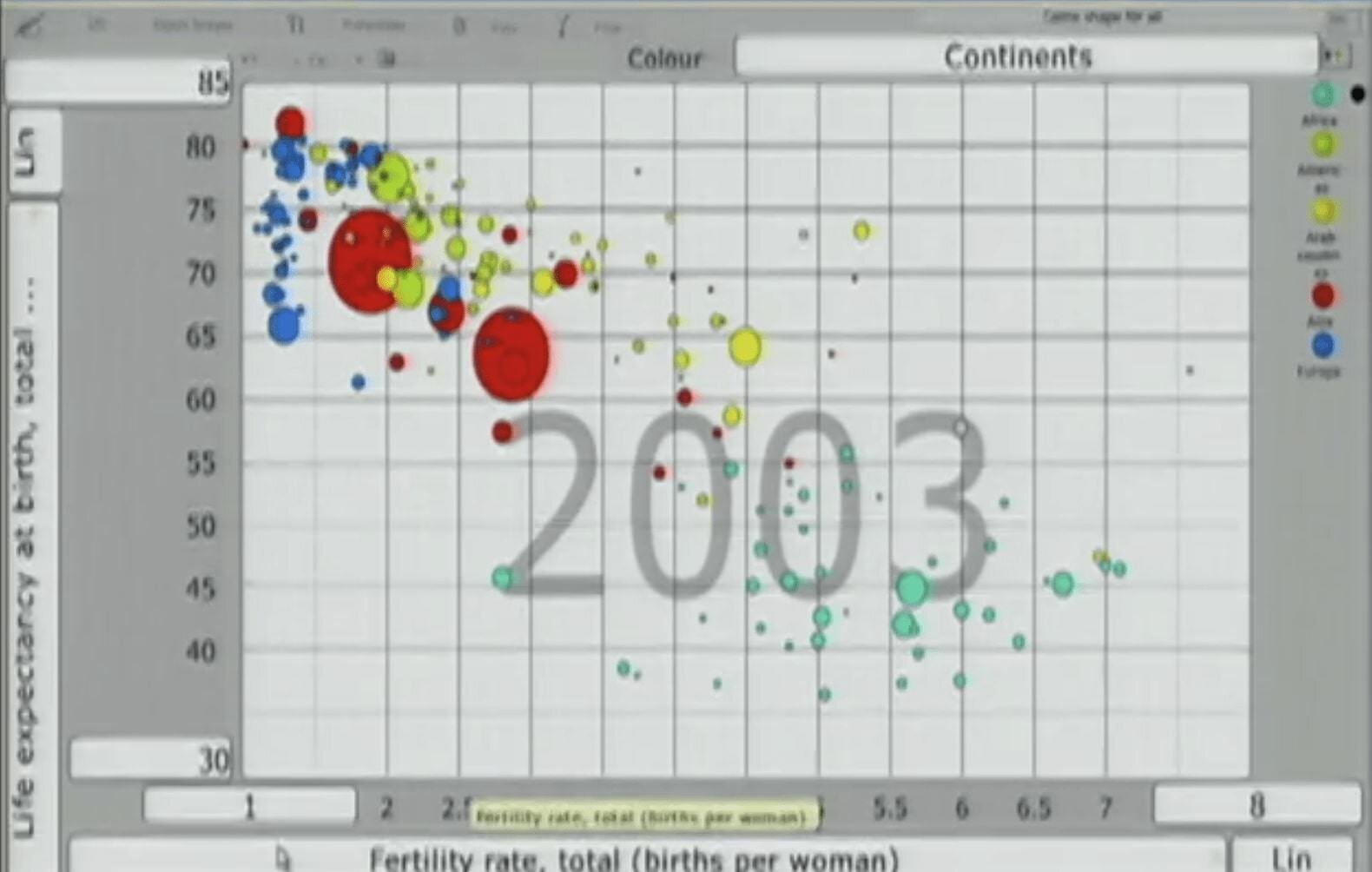
Hans Rosling (1948 to 2017) was a Swedish physician and statistician who became one of the most influential data communicators of the 20th and 21st centuries. His 2006 TED Talk, "The Best Stats You've Ever Seen," used animated bubble charts to show global development trends in a way that demolished widely held assumptions about the divide between the developed and developing world.
What made his presentation remarkable was not the data itself. The data was publicly available. What made it remarkable was how he used motion, storytelling, and plain language to make 200 years of global health and economic change comprehensible in about 20 minutes. He treated the audience as curious people capable of understanding complexity, not as passive recipients of conclusions.
What Analysts Can Learn From His Approach
Rosling started every presentation with a question, usually one that revealed how wrong the audience's assumptions were. He then used data to walk them through the answer step by step, building understanding rather than just displaying a result. He never let the chart do all the work. He narrated it, pointed at it, and connected it to human stories.
The technical lesson: animation and motion encode a dimension of data (time or progression) that static charts cannot. The communication lesson: the analyst's job is not to present data but to guide an audience from confusion to understanding.
“Let the dataset change your mindset ”
Watching Mr. Rosling speak in that Ted Talk changed how I looked at math, data visualization, data storytelling, and I wanted to be when I grew up. Whenever I could, I tried to use the data to tell a story. Also, my approach to whatever I am working on is to bring the same passion as Hans Rosling brought to his work. Again, the goal never changed, I wanted to make that data sing and dance as Hans did.
The Ted Talk is linked above. Granted, it is a bit old in terms of what the visuals look like, but the passion is still there. Be sure to note the excitement and the lesson in data storytelling are all on display in a way only Hans Rosling can do.
Do you remember when something you are currently passionate about entered your life, please share your story with me on - Contact Me
Related Post You Might Enjoy