Impact of a Super Spreader Event: Data Viz In the Wild
My Redesign Viz:

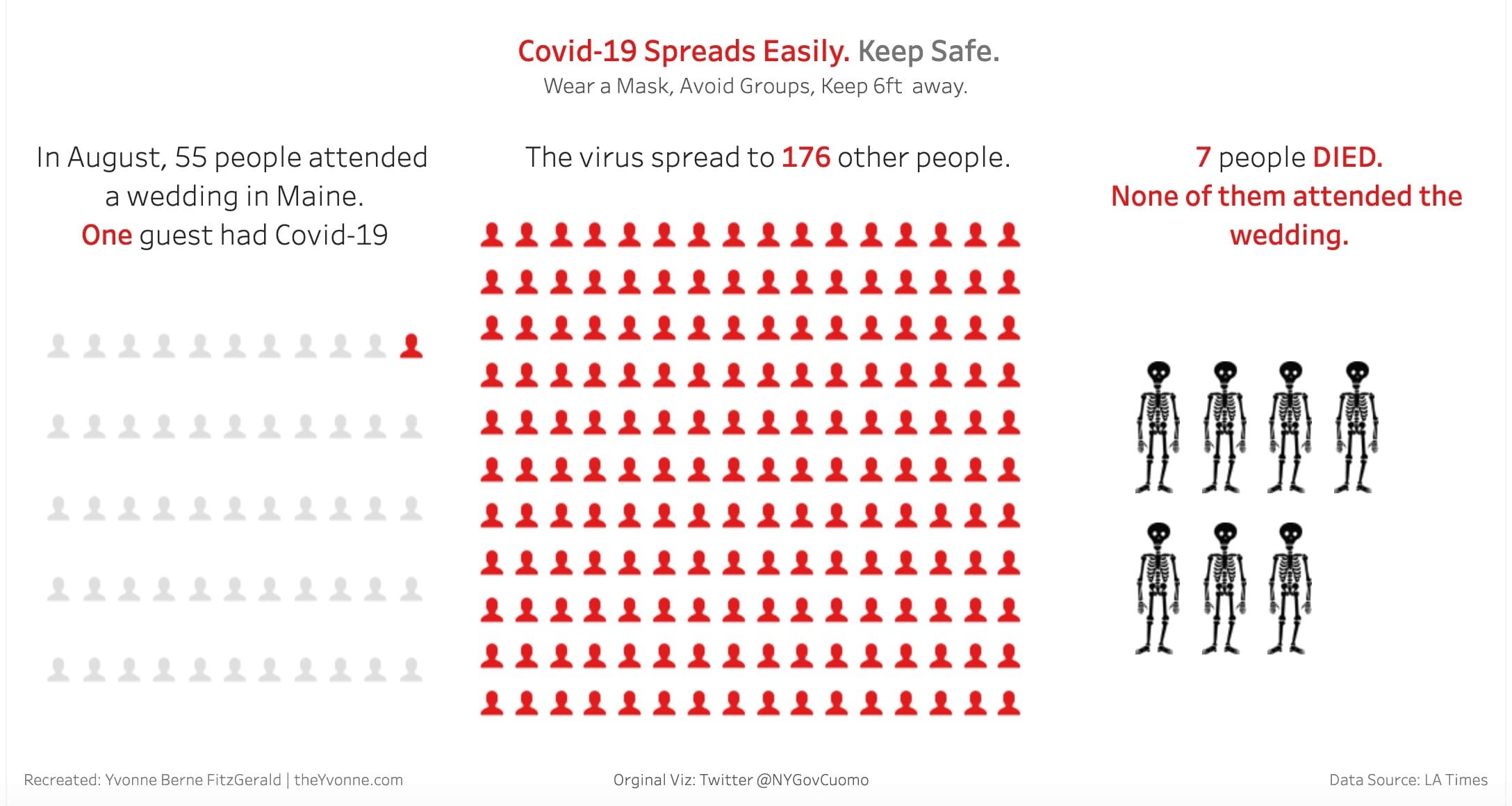
Original Vizulatiation SuperSpreader Wedding Impact Originally in NY Gov Cuomo Twitter Post Nov 13 2020:

Reading time: 59 secs
In mid-November, while looking at my Twitter feed, I saw a data visualization posted by New York Governor Cuomo. It caught my eye because the data had a strong message. The message illustrated the impact of large gatherings and Covid-19 infections. They were referencing a LA Times article about a Covid-19 super spreader wedding in Maine. I thought it was one of the better ones about this topic. The visualization is simple, direct, to the point. As I looked at the viz, I wondered what the visualization would look like with different design decisions.
This week as the holidays approach, I thought back to that viz. I challenged myself to recreate it with my own thoughts and ideas. I am using Tableau to do my redesign. The first change was the original design colors of orange and teal to light gray, red, and black. Red indicates transmission, and black skeletons are showing the loss of lives. The loss of life, I feel, was devastating since none of those that died attended the wedding. Also, I highlighted certain words with red in the text to convey a story by looking at those highlighted items. I like the changes that I made, but I wonder if it is too much with the skeletons.
Looking for datasets or tools to use in your own challenge submissions or additional community challenges? Visit the Resources page for a curated list of data viz tools, free datasets, and community challenges.
For data sources and information covering global development indicators, visit the Public Health & Policy section of the Resources page.
What do you think? Let me know - Contact Me
Have a safe and healthy Thanksgiving and holiday season.
Keep Safe This Holiday Season!
Links:
Viz in The Wild: NY Governor Cuomo Tweet Nov 13, 2020 My Redesign: My Redesign in Tableau
Data: Super-spreading wedding party demonstrates COVID-19 risk posed by holiday gatherings (LA Times)
Related Post You Might Enjoy