
Thoughts and Ideas
Bringing Clarity to Complexity: Data, Sustainability, Public Health, and Ideas That Matter
A blog about bringing clarity to complexity. Posts on data, sustainability, public health, color design, and ideas worth understanding. Written by Yvonne Beirne FitzGerald for the curious, regardless of credentials.

Decreasing Wildlife Populations
The Living Planet Report by the Zoological Society of London (ZSL) and World Wildlife Fund (WWF) is responsible for the Living Planet Index. This project gathers data on the Earth's biodiversity. In 2020, the Living Planet Index reported a 68 % decline in wildlife populations since 1970. This one number is a reflection of 20,000 individual stories on how each animal species is surviving. Having one value is a great way to get an overall understanding; knowing the status of each population is extremely important. This knowledge allows us to prioritize conservation efforts on threatened specials and groups. Looking below the Index value, one can see if different groups have more Stable, Increasing, or Decreasing Populations.

What Does 1GB of Mobile Data Cost By Country?
Connecting to the internet via Mobile Data is critical today. The higher the cost, the more significant the barrier it is for people to improve themselves and enhance their lives. India has the lowest price per 1 GB due to high competitiveness among multiple carriers. The higher cost tends to be driven either by limited competition or limited infrastructure. Data from the Visual Capitalist provided the cost per 1 GB for 155 different countries is the Makeover Monday 2021 Week 19 challenge (What Does 1 GB of Mobile Data Cost in Every Country?)— combining that data with information on World Bank Region and Income Group Classification.
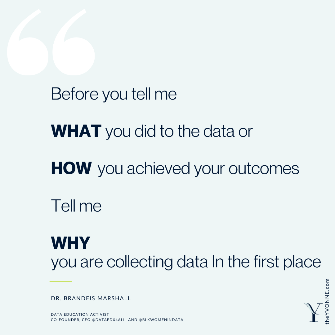
Focus On The Why
Ever have a tweet stick with you after 24 hours? That is what happened to me last night after reading a tweet from Dr. Brandeis Marshall (@csdoctorsister). The writer summarized the critical question one should focus on when doing a data project or any project. Why are you doing the project? Why are you investing your time?

CEO-to-Worker Compensation Ratio Rising
Evaluating Chief Executive Officers (CEO) of 350 of the largest US firms shows that CEO compensation has grown exponentially. In contrast, the average workers' earnings have not increased at the same rate. The report from the Economic Policy Institute indicates that the rate of increase is not due to increased skill but the CEO's ability to set their pay rates.

Global Support of Polish Women's Reproductive Rights
To Jest Wona! This is War! The protesters chanted, not just in Poland, in Europe but around the world. On the 22nd of October 2020, the Polish Constitutional Tribunal voted on a law to prohibit abortion in Poland, practically speaking. 73 % of the people of Poland disagree with the ruling. This vote triggered protests in support of around the world for Polish women and men.

Seats Held by Women in National Parliaments and Governments
Tracking the percentage of women working in Parliament since the European Union (EU) started. Some countries have always had close to 50 % women in government. Other countries have worked to decrease the equality in their parliaments.
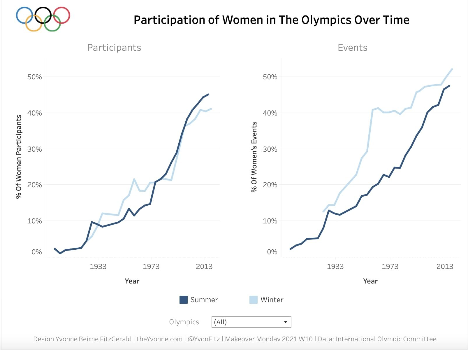
Participation of Women in The Olympics Over Time
Makeover Monday 2021 Week 10 challenge uses data from the International Olympic Committee (IOC) about Women's Participation in The Olympics Over Time. The was selected since that Monday was International Women's Day. The data source is from IOC; the original challenge viz is from an article on swimswam.com. I created line charts that show the number of participants and events for both the Winter and Summer Olympics have been getting closer to 50%. One fantastic fact discovered is the Winter Olympics Events in 2018 were 52% women.

What is the World’s Biggest Cash Crop?
Makeover Monday 2021 Week 11 challenge is to create a viz to answer the question: "What is The World's Biggest Cash Crop?". The data source is from FOASTAT; the original challenge viz is from Information Is Beautiful. Also, not all the data used to create their viz is provided. The second challenge is to create a complete viz in 20 mins to prep for certification testing.

Europe Loves Cocoa Beans
Makeover Monday 2020 Week 52 challenge's topic is Global Import of Cocoa Beans. The source of the data is the Centre for the Promotion of Imports (CBI). After I reviewed the data, my viz's focus was Europe Loves Cocoa Beans, since the EU has the highest levels of cocoa bean imports.

Shape of YOU! Year End Review
Shape of YOU! Year End ReviewWhat is the shape of your life? Ponder the 12 critical areas in life to see what your life looks like right now. Rank each one from 1 Ugg, very bad to 5 Perfect wouldn’t change a thing above, and see how things look and check back from time to time to see how your life is changing.

Is Die Hard a Holiday Movie?
Is Die Harda Holiday Movie?With a character named Holly and set on Christmas Eve, sounds like a holiday movie. Even full of christmas songs, another essential criteria, many say Die Hard can not be called a holiday movie, let alone a classic holiday movie like It's a Wonderful Life. The data confirms not only is Die Hard a holiday movie, but it is also a popular one when compared to the gold standard of holiday movies.

The Digital Gender Gap: Internet and Mobile Access by Country and Gender
The Digital Gender Gap is the Makeover Monday 2020 Week 44 challenge. In 2020 currently, about half of the world's population does not have access to the internet; most are women. This gap is leaving them behind for health, education, and financial information and opportunities. #Viz5
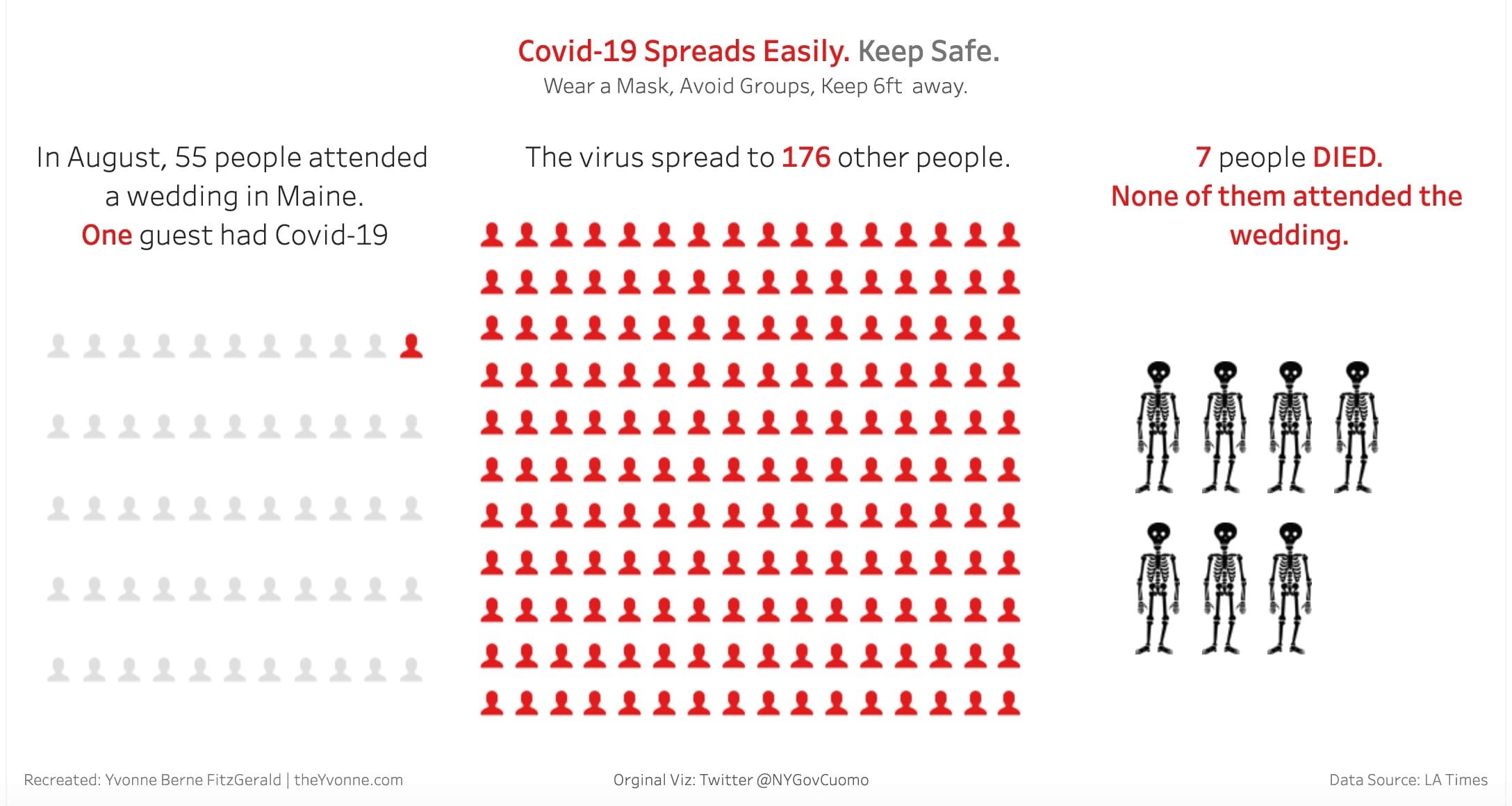
Impact of a Super Spreader Event: Data Viz In the Wild
I saw a data visualization on Covid-19 Super Spreader Events by NY Gov Cuomo. I challenged myself to redesign the viz. #DataVizInTheWild
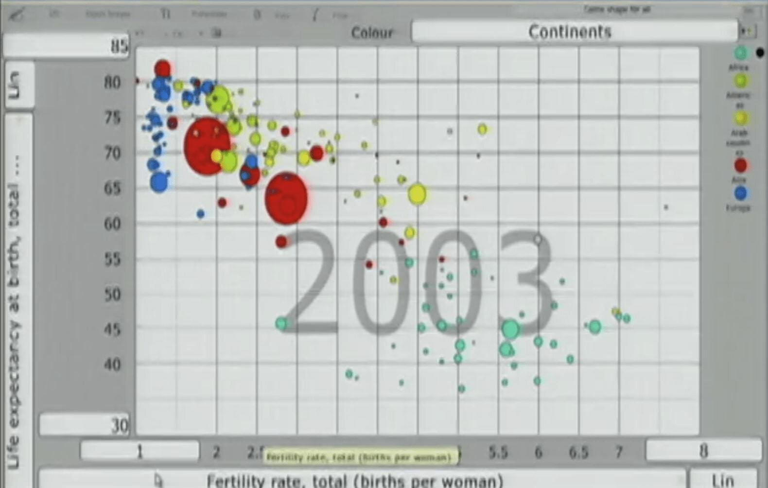
The Day I Fell In Love With Stats
The Ted Talk was by Hans Rosling. He was passionate, and the data did dance and moved and, in a way, sang. That's when I fell in love with stats.

Codevember: Spring Beach Palette
Codevember, a 30-day coding challenge, has started! Day 1 Contrast inspired the Beach Spring Palette Design and the creation of coding cookbooks for myself.